Nested flexbox
In the previous tutorial, we used flexbox to center content vertically and horizontally.
In this lesson, we will learn how to create a complex layout by embedding one flexbox into another.
Step 1 - add main headings
Let's add a main heading to the first column in our intro. We covered text styling in one of the previous lesson, so I won't go into it in detail.
As you can see, we put our headings in an empty div that we
will use for the flexbox (which in the next steps we will put in another
flexbox, creating a nexted flexbox).
    <!-- First column -->
    <div class="hidden lg:block">
      <!-- Inner flexbox wrapper for headings -->
      <div class="">
        <!-- Headings -->
        <div class="text-gray-600">
          <h1 class="mb-5 text-6xl font-light">John Doe</h1>
          <h2 class="mb-7 text-6xl font-bold uppercase">Web developer</h2>
        </div>
      </div>
    </div>
    <!-- First column -->
John Doe
Web developer
Step 2 - center the content using flexbox
Using the flexbox classes we learned in the
previous tutorial, let's center the content vertically by adding these classes to the
div we have prepared for flexbox.
    <!-- Inner flexbox wrapper for headings -->
    <div class="flex h-full items-center">
      <!-- Headings -->
      <div class="text-gray-600">
        <h1 class="mb-5 text-6xl font-light">John Doe</h1>
        <h2 class="mb-7 text-6xl font-bold uppercase">Web developer</h2>
      </div>
    </div>
We will deal with horizontal centering in the next steps.

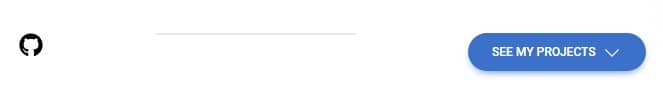
Step 3 - add CTA (Call to Action) elements
Below the flexbox wrapper for headings we will add another div with a few more elements: a GitHub icon, a divider and a button (we covered all these things in the previous tutorial, so I won't dwell on it here).
    <!-- Inner flexbox wrapper for headings -->
    <div class="flex h-full items-center">
      <!-- Headings -->
      <div class="text-gray-600">
        <h1 class="mb-5 text-6xl font-light">John Doe</h1>
        <h2 class="mb-7 text-6xl font-bold uppercase">Web developer</h2>
      </div>
    </div>

    <!-- Inner flexbox wrapper for CTA elements -->
    <div class="">
      <a href="" target="_blank">
        <svg
          xmlns="http://www.w3.org/2000/svg"
          class="h-6 w-6"
          viewBox="0 0 496 512">
          <!--! Font Awesome Free 6.4.2 by @fontawesome - https://fontawesome.com License - https://fontawesome.com/license (Commercial License) Copyright 2023 Fonticons, Inc. -->
          <path
            d="M165.9 397.4c0 2-2.3 3.6-5.2 3.6-3.3.3-5.6-1.3-5.6-3.6 0-2 2.3-3.6 5.2-3.6 3-.3 5.6 1.3 5.6 3.6zm-31.1-4.5c-.7 2 1.3 4.3 4.3 4.9 2.6 1 5.6 0 6.2-2s-1.3-4.3-4.3-5.2c-2.6-.7-5.5.3-6.2 2.3zm44.2-1.7c-2.9.7-4.9 2.6-4.6 4.9.3 2 2.9 3.3 5.9 2.6 2.9-.7 4.9-2.6 4.6-4.6-.3-1.9-3-3.2-5.9-2.9zM244.8 8C106.1 8 0 113.3 0 252c0 110.9 69.8 205.8 169.5 239.2 12.8 2.3 17.3-5.6 17.3-12.1 0-6.2-.3-40.4-.3-61.4 0 0-70 15-84.7-29.8 0 0-11.4-29.1-27.8-36.6 0 0-22.9-15.7 1.6-15.4 0 0 24.9 2 38.6 25.8 21.9 38.6 58.6 27.5 72.9 20.9 2.3-16 8.8-27.1 16-33.7-55.9-6.2-112.3-14.3-112.3-110.5 0-27.5 7.6-41.3 23.6-58.9-2.6-6.5-11.1-33.3 2.6-67.9 20.9-6.5 69 27 69 27 20-5.6 41.5-8.5 62.8-8.5s42.8 2.9 62.8 8.5c0 0 48.1-33.6 69-27 13.7 34.7 5.2 61.4 2.6 67.9 16 17.7 25.8 31.5 25.8 58.9 0 96.5-58.9 104.2-114.8 110.5 9.2 7.9 17 22.9 17 46.4 0 33.7-.3 75.4-.3 83.6 0 6.5 4.6 14.4 17.3 12.1C428.2 457.8 496 362.9 496 252 496 113.3 383.5 8 244.8 8zM97.2 352.9c-1.3 1-1 3.3.7 5.2 1.6 1.6 3.9 2.3 5.2 1 1.3-1 1-3.3-.7-5.2-1.6-1.6-3.9-2.3-5.2-1zm-10.8-8.1c-.7 1.3.3 2.9 2.3 3.9 1.6 1 3.6.7 4.3-.7.7-1.3-.3-2.9-2.3-3.9-2-.6-3.6-.3-4.3.7zm32.4 35.6c-1.6 1.3-1 4.3 1.3 6.2 2.3 2.3 5.2 2.6 6.5 1 1.3-1.3.7-4.3-1.3-6.2-2.2-2.3-5.2-2.6-6.5-1zm-11.4-14.7c-1.6 1-1.6 3.6 0 5.9 1.6 2.3 4.3 3.3 5.6 2.3 1.6-1.3 1.6-3.9 0-6.2-1.4-2.3-4-3.3-5.6-2z" />
        </svg>
      </a>

      <div class="h-[2px] w-[200px] bg-gray-200"></div>

      <a
        role="button"
        data-twe-ripple-init
        data-twe-ripple-color="light"
        class="inline-block rounded-full bg-primary px-6 pb-2 pt-2.5 text-xs font-medium uppercase leading-normal text-white shadow-[0_4px_9px_-4px_#3b71ca] transition duration-150 ease-in-out hover:bg-primary-600 hover:shadow-[0_8px_9px_-4px_rgba(59,113,202,0.3),0_4px_18px_0_rgba(59,113,202,0.2)] focus:bg-primary-600 focus:shadow-[0_8px_9px_-4px_rgba(59,113,202,0.3),0_4px_18px_0_rgba(59,113,202,0.2)] focus:outline-none focus:ring-0 active:bg-primary-700 active:shadow-[0_8px_9px_-4px_rgba(59,113,202,0.3),0_4px_18px_0_rgba(59,113,202,0.2)] dark:shadow-[0_4px_9px_-4px_rgba(59,113,202,0.5)] dark:hover:shadow-[0_8px_9px_-4px_rgba(59,113,202,0.2),0_4px_18px_0_rgba(59,113,202,0.1)] dark:focus:shadow-[0_8px_9px_-4px_rgba(59,113,202,0.2),0_4px_18px_0_rgba(59,113,202,0.1)] dark:active:shadow-[0_8px_9px_-4px_rgba(59,113,202,0.2),0_4px_18px_0_rgba(59,113,202,0.1)]">
        See my projects
        <svg
          xmlns="http://www.w3.org/2000/svg"
          fill="none"
          viewBox="0 0 24 24"
          stroke-width="1.5"
          stroke="currentColor"
          class="ms-1 inline h-5 w-5">
          <path
            stroke-linecap="round"
            stroke-linejoin="round"
            d="M19.5 8.25l-7.5 7.5-7.5-7.5" />
        </svg>
      </a>
    </div>
Now Our CTA has landed in the lower left corner of the screen. Let's fix it.

Step 4 - fix CTA elements
Now we need to make the CTA elements line up horizontally in one line.
So we need to add another flexbox, this time to the wrapper containing the CTA. We've already prepared an empty div for adding the appropriate flexbox classes, so let's do that right away.
To the
<!-- Inner flexbox wrapper for CTA elements --> add
classes .flex, .items-center,
.justify-between, .px-10, .pb-8.
    <!-- Inner flexbox wrapper for CTA elements -->
    <div class="flex items-center justify-between px-10 pb-8">[...]</div>
We've used all of these classes before. The only new feature is the justify-between class.
The .justify-between class in Tailwind CSS is used to justify
the content of a flex or grid container by distributing the space evenly
between the start and end edges of the container. This means that the
content will be spread out evenly, with equal margins on either side.

Also worth noting is the use of the .items-center class.
Without it, the elements will be unevenly arranged according to each other.
Adding the .items-center class will center the elements
vertically.

Step 5 - add one more flexbox
Now something tricky - we want the headings to stay in the center, but move CTA elements to the bottom edge of the screen. At the same time, we don't want the CTA elements to protrude beyond 100% of the screen height, as it is now. Everything has to fit in a single view.
To achieve this, we need to put our current flexbox wrappers into one external flexbox wrapper.
    <!-- Outer wrapper for flexbox -->
    <div class="">
      <!-- Inner flexbox wrapper for headings -->
      <div class="flex h-full items-center">
        <!-- Headings -->
        <div class="text-gray-600">
          <h1 class="mb-5 text-6xl font-light">John Doe</h1>
          <h2 class="mb-7 text-6xl font-bold uppercase">Web developer</h2>
        </div>
      </div>

      <!-- Inner flexbox wrapper for CTA elements -->
      <div class="flex items-center justify-between  px-10 pb-8">
        <a href="" target="_blank">
          <svg
            xmlns="http://www.w3.org/2000/svg"
            class="h-6 w-6"
            viewBox="0 0 496 512">
            <!--! Font Awesome Free 6.4.2 by @fontawesome - https://fontawesome.com License - https://fontawesome.com/license (Commercial License) Copyright 2023 Fonticons, Inc. -->
            <path
              d="M165.9 397.4c0 2-2.3 3.6-5.2 3.6-3.3.3-5.6-1.3-5.6-3.6 0-2 2.3-3.6 5.2-3.6 3-.3 5.6 1.3 5.6 3.6zm-31.1-4.5c-.7 2 1.3 4.3 4.3 4.9 2.6 1 5.6 0 6.2-2s-1.3-4.3-4.3-5.2c-2.6-.7-5.5.3-6.2 2.3zm44.2-1.7c-2.9.7-4.9 2.6-4.6 4.9.3 2 2.9 3.3 5.9 2.6 2.9-.7 4.9-2.6 4.6-4.6-.3-1.9-3-3.2-5.9-2.9zM244.8 8C106.1 8 0 113.3 0 252c0 110.9 69.8 205.8 169.5 239.2 12.8 2.3 17.3-5.6 17.3-12.1 0-6.2-.3-40.4-.3-61.4 0 0-70 15-84.7-29.8 0 0-11.4-29.1-27.8-36.6 0 0-22.9-15.7 1.6-15.4 0 0 24.9 2 38.6 25.8 21.9 38.6 58.6 27.5 72.9 20.9 2.3-16 8.8-27.1 16-33.7-55.9-6.2-112.3-14.3-112.3-110.5 0-27.5 7.6-41.3 23.6-58.9-2.6-6.5-11.1-33.3 2.6-67.9 20.9-6.5 69 27 69 27 20-5.6 41.5-8.5 62.8-8.5s42.8 2.9 62.8 8.5c0 0 48.1-33.6 69-27 13.7 34.7 5.2 61.4 2.6 67.9 16 17.7 25.8 31.5 25.8 58.9 0 96.5-58.9 104.2-114.8 110.5 9.2 7.9 17 22.9 17 46.4 0 33.7-.3 75.4-.3 83.6 0 6.5 4.6 14.4 17.3 12.1C428.2 457.8 496 362.9 496 252 496 113.3 383.5 8 244.8 8zM97.2 352.9c-1.3 1-1 3.3.7 5.2 1.6 1.6 3.9 2.3 5.2 1 1.3-1 1-3.3-.7-5.2-1.6-1.6-3.9-2.3-5.2-1zm-10.8-8.1c-.7 1.3.3 2.9 2.3 3.9 1.6 1 3.6.7 4.3-.7.7-1.3-.3-2.9-2.3-3.9-2-.6-3.6-.3-4.3.7zm32.4 35.6c-1.6 1.3-1 4.3 1.3 6.2 2.3 2.3 5.2 2.6 6.5 1 1.3-1.3.7-4.3-1.3-6.2-2.2-2.3-5.2-2.6-6.5-1zm-11.4-14.7c-1.6 1-1.6 3.6 0 5.9 1.6 2.3 4.3 3.3 5.6 2.3 1.6-1.3 1.6-3.9 0-6.2-1.4-2.3-4-3.3-5.6-2z" />
          </svg>
        </a>

        <div class="h-[2px] w-[200px] bg-gray-200"></div>

        <a
          role="button"
          data-twe-ripple-init
          data-twe-ripple-color="light"
          class="inline-block rounded-full bg-primary px-6 pb-2 pt-2.5 text-xs font-medium uppercase leading-normal text-white shadow-[0_4px_9px_-4px_#3b71ca] transition duration-150 ease-in-out hover:bg-primary-600 hover:shadow-[0_8px_9px_-4px_rgba(59,113,202,0.3),0_4px_18px_0_rgba(59,113,202,0.2)] focus:bg-primary-600 focus:shadow-[0_8px_9px_-4px_rgba(59,113,202,0.3),0_4px_18px_0_rgba(59,113,202,0.2)] focus:outline-none focus:ring-0 active:bg-primary-700 active:shadow-[0_8px_9px_-4px_rgba(59,113,202,0.3),0_4px_18px_0_rgba(59,113,202,0.2)] dark:shadow-[0_4px_9px_-4px_rgba(59,113,202,0.5)] dark:hover:shadow-[0_8px_9px_-4px_rgba(59,113,202,0.2),0_4px_18px_0_rgba(59,113,202,0.1)] dark:focus:shadow-[0_8px_9px_-4px_rgba(59,113,202,0.2),0_4px_18px_0_rgba(59,113,202,0.1)] dark:active:shadow-[0_8px_9px_-4px_rgba(59,113,202,0.2),0_4px_18px_0_rgba(59,113,202,0.1)]">
          See my projects
          <svg
            xmlns="http://www.w3.org/2000/svg"
            fill="none"
            viewBox="0 0 24 24"
            stroke-width="1.5"
            stroke="currentColor"
            class="ms-1 inline h-5 w-5">
            <path
              stroke-linecap="round"
              stroke-linejoin="round"
              d="M19.5 8.25l-7.5 7.5-7.5-7.5" />
          </svg>
        </a>
      </div>
    </div>
    <!-- Outer wrapper for flexbox -->
Now everything seems even more messed up, but don't worry - we'll fix it soon.

Let's start by giving the outer wrapper a height of 100% to be able to stretch its content. Next, let's add flexbox classes to center everything horizontally and vertically.
    <!-- Outer wrapper for flexbox -->
    <div class="flex h-full items-center justify-center">[...]</div>
    <!-- Outer wrapper for flexbox -->
After saving the file, you will see a terrible mess. However, contrary to appearances, everything worked as it should and we are very close to the final solution.

Step 6 - change the direction of the flexbox
By default, the flexbox is set horizontally, as you can see in our intro - all elements are arranged in one line instead of one below the other.
We can easily fix this by changing the direction of the flexbox from horizontal to vertical.
Just add the .flex-col class to the outer flexbox wrapper:
    <!-- Outer wrapper for flexbox -->
    <div class="flex h-full flex-col items-center justify-center">[...]</div>
    <!-- Outer wrapper for flexbox -->
And now it works (almost) perfect instead of horizontally, our flexbox changed from default to vertical, aligning from top to bottom instead of left to right.

We just need to make a little adjustment to our CTA. To stretch them to full
width again, let's add the .w-full class to the CTA wrapper.
    <!-- Inner flexbox wrapper for CTA elements -->
    <div class="flex w-full items-center justify-between px-10 pb-8">[...]</div>
Now it's exactly how it should be!

Huh, that was crazy. Flexbox next to flexbox inserted into another flexbox.

For complex concepts such as nested flexbox, there is no better way to consolidate knowledge than simply experimenting. Before moving on to the next lesson, play around with our new intro - add and subtract individual flexbox classes to see what happens.
And if something in the tutorial is not clear, hit me up on twitter!
Note: If you want to practice on your own and have a look at more examples you can play with our flexbox generator.

About author
Michal Szymanski
Co Founder at TW Elements and MDBootstrap / Listed in Forbes „30 under 30" / Open-source enthusiast / Dancer, nerd & book lover.
Author of hundreds of articles on programming, business, marketing and productivity. In the past, an educator working with troubled youth in orphanages and correctional facilities.