Containers
If you've used Bootstrap before, you probably remember that there containers are necessary for the proper functioning of the grid system.
So it can be a bit confusing that in Tailwind containers don't have such an important function, and grid can do just fine without them.
However, this does not mean that containers are useless in Tailwind. Quite the opposite. But they just play a different role.
Let's have a look at them.
How does a container work in Tailwind CSS?
In Tailwind we use containers to set a maximum width for a content we want to place inside of the container.
In other words - we use containers so that a given element / content placed in this container does not extend to the full width of the screen.
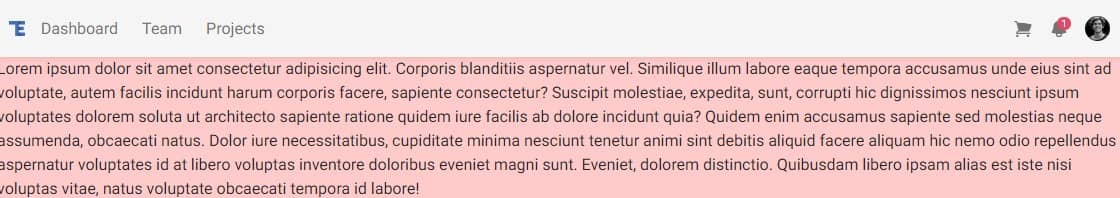
Have a look at the example below.
Let's add a long text paragraph to the <main> section of
our project. In addition, let's add the .bg-red-200 class to it
to be able to clearly see how wide this paragraph extends.
    <!--Main layout-->
    <main>
      <p class="bg-red-200">
        Lorem ipsum dolor sit amet consectetur adipisicing elit. Corporis
        blanditiis aspernatur vel. Similique illum labore eaque tempora
        accusamus unde eius sint ad voluptate, autem facilis incidunt harum
        corporis facere, sapiente consectetur? Suscipit molestiae, expedita,
        sunt, corrupti hic dignissimos nesciunt ipsum voluptates dolorem soluta
        ut architecto sapiente ratione quidem iure facilis ab dolore incidunt
        quia? Quidem enim accusamus sapiente sed molestias neque assumenda,
        obcaecati natus. Dolor iure necessitatibus, cupiditate minima nesciunt
        tenetur animi sint debitis aliquid facere aliquam hic nemo odio
        repellendus aspernatur voluptates id at libero voluptas inventore
        doloribus eveniet magni sunt. Eveniet, dolorem distinctio. Quibusdam
        libero ipsam alias est iste nisi voluptas vitae, natus voluptate
        obcaecati tempora id labore!
      </p>
    </main>
    <!--Main layout-->
The paragraph will span the full width of the page. This is often not a desirable situation, which is why we have containers at our disposal.
So what happens if we add an element with class .container to
the project and put our paragraph in it?
    <!--Main layout-->
    <main>
      <div class="container">
        <p class="bg-red-200">
          Lorem ipsum dolor sit amet consectetur adipisicing elit. Corporis
          blanditiis aspernatur vel. Similique illum labore eaque tempora
          accusamus unde eius sint ad voluptate, autem facilis incidunt harum
          corporis facere, sapiente consectetur? Suscipit molestiae, expedita,
          sunt, corrupti hic dignissimos nesciunt ipsum voluptates dolorem
          soluta ut architecto sapiente ratione quidem iure facilis ab dolore
          incidunt quia? Quidem enim accusamus sapiente sed molestias neque
          assumenda, obcaecati natus. Dolor iure necessitatibus, cupiditate
          minima nesciunt tenetur animi sint debitis aliquid facere aliquam hic
          nemo odio repellendus aspernatur voluptates id at libero voluptas
          inventore doloribus eveniet magni sunt. Eveniet, dolorem distinctio.
          Quibusdam libero ipsam alias est iste nisi voluptas vitae, natus
          voluptate obcaecati tempora id labore!
        </p>
      </div>
    </main>
    <!--Main layout-->
Well, actually the paragraph won't be full-width anymore, but that's not quite what we wanted. A strange-looking gap appeared on the right side.
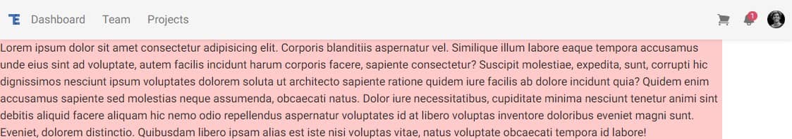
This is because, unlike, for example containers in Bootstrap, containers in Tailwind do not auto-center.
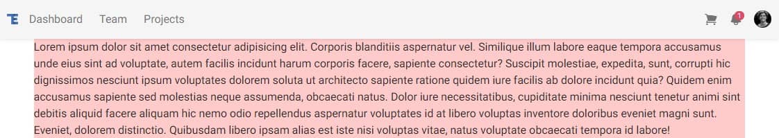
To get the centering effect, we need to add the .mx-auto class
to the .container, which will divide the left and right margins
of the .container equally.
    <!--Main layout-->
    <main>
      <div class="container mx-auto">
        <p class="bg-red-200">
          Lorem ipsum dolor sit amet consectetur adipisicing elit. Corporis
          blanditiis aspernatur vel. Similique illum labore eaque tempora
          accusamus unde eius sint ad voluptate, autem facilis incidunt harum
          corporis facere, sapiente consectetur? Suscipit molestiae, expedita,
          sunt, corrupti hic dignissimos nesciunt ipsum voluptates dolorem
          soluta ut architecto sapiente ratione quidem iure facilis ab dolore
          incidunt quia? Quidem enim accusamus sapiente sed molestias neque
          assumenda, obcaecati natus. Dolor iure necessitatibus, cupiditate
          minima nesciunt tenetur animi sint debitis aliquid facere aliquam hic
          nemo odio repellendus aspernatur voluptates id at libero voluptas
          inventore doloribus eveniet magni sunt. Eveniet, dolorem distinctio.
          Quibusdam libero ipsam alias est iste nisi voluptas vitae, natus
          voluptate obcaecati tempora id labore!
        </p>
      </div>
    </main>
    <!--Main layout-->
And now, by dividing the left and right margins equally (thanks to
.mx-auto class), our container has been centered.
Alright, now that we know how containers work, let's use them for something practical.
But first, let's remove this sample container paragraph from the
<main> section, as it was for demonstration purposes
only.
    <!--Main layout-->
    <main></main>
    <!--Main layout-->
Add container to the Navbar
Currently, the elements in our Navbar are stretched to full width and touch the left and right edges of the browser window.
It would be nice if we could give them some space on the sides and center them.
This is the perfect opportunity to make use of the container.
Inside of the <nav> element, find the
<div> element that is its direct child. There will
already be a few other classes there, but that's okay.
Add .container and .mx-auto classes there:
    <!-- Navbar -->
    <nav
      class="flex-no-wrap relative flex w-full items-center justify-between bg-neutral-100 py-2 shadow-md shadow-black/5 dark:bg-neutral-600 dark:shadow-black/10 lg:flex-wrap lg:justify-start lg:py-4"
      data-twe-navbar-ref>
      <!-- Here add a container -->
      <div
        class="container mx-auto flex w-full flex-wrap items-center justify-between px-3">
        <!-- Hamburger button for mobile view -->
        <button
          class="block border-0 bg-transparent px-2 text-neutral-500 hover:no-underline hover:shadow-none focus:no-underline focus:shadow-none focus:outline-none focus:ring-0 dark:text-neutral-200 lg:hidden"
          type="button"
          data-twe-collapse-init
          data-twe-target="#navbarSupportedContent1"
          aria-controls="navbarSupportedContent1"
          aria-expanded="false"
          aria-label="Toggle navigation">
          <!-- Hamburger icon -->
          <span class="[&>svg]:w-7">
            <svg
              xmlns="http://www.w3.org/2000/svg"
              viewBox="0 0 24 24"
              fill="currentColor"
              class="h-7 w-7">
              <path
                fill-rule="evenodd"
                d="M3 6.75A.75.75 0 013.75 6h16.5a.75.75 0 010 1.5H3.75A.75.75 0 013 6.75zM3 12a.75.75 0 01.75-.75h16.5a.75.75 0 010 1.5H3.75A.75.75 0 013 12zm0 5.25a.75.75 0 01.75-.75h16.5a.75.75 0 010 1.5H3.75a.75.75 0 01-.75-.75z"
                clip-rule="evenodd" />
            </svg>
          </span>
        </button>

        <!-- Collapsible navigation container -->
        <div
          class="!visible hidden flex-grow basis-[100%] items-center lg:!flex lg:basis-auto"
          id="navbarSupportedContent1"
          data-twe-collapse-item>
          <!-- Logo -->
          <a
            class="mb-4 me-2 mt-3 flex items-center text-neutral-900 hover:text-neutral-900 focus:text-neutral-900 dark:text-neutral-200 dark:hover:text-neutral-400 dark:focus:text-neutral-400 lg:mb-0 lg:mt-0"
            href="#">
            <img
              src="https://tecdn.b-cdn.net/img/logo/te-transparent-noshadows.webp"
              style="height: 15px"
              alt=""
              loading="lazy" />
          </a>
          <!-- Left navigation links -->
          <ul
            class="list-style-none me-auto flex flex-col ps-0 lg:flex-row"
            data-twe-navbar-nav-ref>
            <li class="mb-4 lg:mb-0 lg:pe-2" data-twe-nav-item-ref>
              <!-- Dashboard link -->
              <a
                class="text-neutral-500 hover:text-neutral-700 focus:text-neutral-700 disabled:text-black/30 dark:text-neutral-200 dark:hover:text-neutral-300 dark:focus:text-neutral-300 lg:px-2 [&.active]:text-black/90 dark:[&.active]:text-zinc-400"
                href="#"
                data-twe-nav-link-ref
                >Dashboard</a
              >
            </li>
            <!-- Team link -->
            <li class="mb-4 lg:mb-0 lg:pe-2" data-twe-nav-item-ref>
              <a
                class="text-neutral-500 hover:text-neutral-700 focus:text-neutral-700 disabled:text-black/30 dark:text-neutral-200 dark:hover:text-neutral-300 dark:focus:text-neutral-300 lg:px-2 [&.active]:text-black/90 dark:[&.active]:text-neutral-400"
                href="#"
                data-twe-nav-link-ref
                >Team</a
              >
            </li>
            <!-- Projects link -->
            <li class="mb-4 lg:mb-0 lg:pe-2" data-twe-nav-item-ref>
              <a
                class="text-neutral-500 hover:text-neutral-700 focus:text-neutral-700 disabled:text-black/30 dark:text-neutral-200 dark:hover:text-neutral-300 dark:focus:text-neutral-300 lg:px-2 [&.active]:text-black/90 dark:[&.active]:text-neutral-400"
                href="#"
                data-twe-nav-link-ref
                >Projects</a
              >
            </li>
          </ul>
        </div>

        <!-- Right elements -->
        <div class="relative flex items-center">
          <!-- Cart Icon -->
          <a
            class="me-4 text-neutral-500 hover:text-neutral-700 focus:text-neutral-700 disabled:text-black/30 dark:text-neutral-200 dark:hover:text-neutral-300 dark:focus:text-neutral-300 [&.active]:text-black/90 dark:[&.active]:text-neutral-400"
            href="#">
            <span class="[&>svg]:w-5">
              <svg
                xmlns="http://www.w3.org/2000/svg"
                viewBox="0 0 24 24"
                fill="currentColor"
                class="h-5 w-5">
                <path
                  d="M2.25 2.25a.75.75 0 000 1.5h1.386c.17 0 .318.114.362.278l2.558 9.592a3.752 3.752 0 00-2.806 3.63c0 .414.336.75.75.75h15.75a.75.75 0 000-1.5H5.378A2.25 2.25 0 017.5 15h11.218a.75.75 0 00.674-.421 60.358 60.358 0 002.96-7.228.75.75 0 00-.525-.965A60.864 60.864 0 005.68 4.509l-.232-.867A1.875 1.875 0 003.636 2.25H2.25zM3.75 20.25a1.5 1.5 0 113 0 1.5 1.5 0 01-3 0zM16.5 20.25a1.5 1.5 0 113 0 1.5 1.5 0 01-3 0z" />
              </svg>
            </span>
          </a>

          <!-- Container with two dropdown menus -->
          <div class="relative" data-twe-dropdown-ref>
            <!-- First dropdown trigger -->
            <a
              class="hidden-arrow me-4 flex items-center text-neutral-500 hover:text-neutral-700 focus:text-neutral-700 disabled:text-black/30 dark:text-neutral-200 dark:hover:text-neutral-300 dark:focus:text-neutral-300 [&.active]:text-black/90 dark:[&.active]:text-neutral-400"
              href="#"
              id="dropdownMenuButton1"
              role="button"
              data-twe-dropdown-toggle-ref
              aria-expanded="false">
              <!-- Dropdown trigger icon -->
              <span class="[&>svg]:w-5">
                <svg
                  xmlns="http://www.w3.org/2000/svg"
                  viewBox="0 0 24 24"
                  fill="currentColor"
                  class="h-5 w-5">
                  <path
                    fill-rule="evenodd"
                    d="M5.25 9a6.75 6.75 0 0113.5 0v.75c0 2.123.8 4.057 2.118 5.52a.75.75 0 01-.297 1.206c-1.544.57-3.16.99-4.831 1.243a3.75 3.75 0 11-7.48 0 24.585 24.585 0 01-4.831-1.244.75.75 0 01-.298-1.205A8.217 8.217 0 005.25 9.75V9zm4.502 8.9a2.25 2.25 0 104.496 0 25.057 25.057 0 01-4.496 0z"
                    clip-rule="evenodd" />
                </svg>
              </span>
              <!-- Notification counter -->
              <span
                class="absolute -mt-2.5 ms-2 rounded-[0.37rem] bg-danger px-[0.45em] py-[0.2em] text-[0.6rem] leading-none text-white"
                >1</span
              >
            </a>
            <!-- First dropdown menu -->
            <ul
              class="absolute left-auto right-0 z-[1000] float-left m-0 mt-1 hidden min-w-max list-none overflow-hidden rounded-lg border-none bg-white bg-clip-padding text-left text-base shadow-lg data-[twe-dropdown-show]:block dark:bg-neutral-700"
              aria-labelledby="dropdownMenuButton1"
              data-twe-dropdown-menu-ref>
              <!-- First dropdown menu items -->
              <li>
                <a
                  class="block w-full whitespace-nowrap bg-transparent px-4 py-2 text-sm font-normal text-neutral-700 hover:bg-neutral-100 active:text-neutral-800 active:no-underline disabled:pointer-events-none disabled:bg-transparent disabled:text-neutral-400 dark:text-neutral-200 dark:hover:bg-white/30"
                  href="#"
                  data-twe-dropdown-item-ref
                  >Action</a
                >
              </li>
              <li>
                <a
                  class="block w-full whitespace-nowrap bg-transparent px-4 py-2 text-sm font-normal text-neutral-700 hover:bg-neutral-100 active:text-neutral-800 active:no-underline disabled:pointer-events-none disabled:bg-transparent disabled:text-neutral-400 dark:text-neutral-200 dark:hover:bg-white/30"
                  href="#"
                  data-twe-dropdown-item-ref
                  >Another action</a
                >
              </li>
              <li>
                <a
                  class="block w-full whitespace-nowrap bg-transparent px-4 py-2 text-sm font-normal text-neutral-700 hover:bg-neutral-100 active:text-neutral-800 active:no-underline disabled:pointer-events-none disabled:bg-transparent disabled:text-neutral-400 dark:text-neutral-200 dark:hover:bg-white/30"
                  href="#"
                  data-twe-dropdown-item-ref
                  >Something else here</a
                >
              </li>
            </ul>
          </div>

          <!-- Second dropdown container -->
          <div class="relative" data-twe-dropdown-ref>
            <!-- Second dropdown trigger -->
            <a
              class="hidden-arrow flex items-center whitespace-nowrap transition duration-150 ease-in-out motion-reduce:transition-none"
              href="#"
              id="dropdownMenuButton2"
              role="button"
              data-twe-dropdown-toggle-ref
              aria-expanded="false">
              <!-- User avatar -->
              <img
                src="https://tecdn.b-cdn.net/img/new/avatars/2.jpg"
                class="rounded-full"
                style="height: 25px; width: 25px"
                alt=""
                loading="lazy" />
            </a>
            <!-- Second dropdown menu -->
            <ul
              class="absolute left-auto right-0 z-[1000] float-left m-0 mt-1 hidden min-w-max list-none overflow-hidden rounded-lg border-none bg-white bg-clip-padding text-left text-base shadow-lg data-[twe-dropdown-show]:block dark:bg-neutral-700"
              aria-labelledby="dropdownMenuButton2"
              data-twe-dropdown-menu-ref>
              <!-- Second dropdown menu items -->
              <li>
                <a
                  class="block w-full whitespace-nowrap bg-transparent px-4 py-2 text-sm font-normal text-neutral-700 hover:bg-neutral-100 active:text-neutral-800 active:no-underline disabled:pointer-events-none disabled:bg-transparent disabled:text-neutral-400 dark:text-neutral-200 dark:hover:bg-white/30"
                  href="#"
                  data-twe-dropdown-item-ref
                  >Action</a
                >
              </li>
              <li>
                <a
                  class="block w-full whitespace-nowrap bg-transparent px-4 py-2 text-sm font-normal text-neutral-700 hover:bg-neutral-100 active:text-neutral-800 active:no-underline disabled:pointer-events-none disabled:bg-transparent disabled:text-neutral-400 dark:text-neutral-200 dark:hover:bg-white/30"
                  href="#"
                  data-twe-dropdown-item-ref
                  >Another action</a
                >
              </li>
              <li>
                <a
                  class="block w-full whitespace-nowrap bg-transparent px-4 py-2 text-sm font-normal text-neutral-700 hover:bg-neutral-100 active:text-neutral-800 active:no-underline disabled:pointer-events-none disabled:bg-transparent disabled:text-neutral-400 dark:text-neutral-200 dark:hover:bg-white/30"
                  href="#"
                  data-twe-dropdown-item-ref
                  >Something else here</a
                >
              </li>
            </ul>
          </div>
        </div>
      </div>
    </nav>
    <!-- Navbar -->
And now we have proper margins on the right and left side of the Navbar.
But there is another problem - when we reduce the size of the browser window, the margins remain the same size. On the big screen it looks correct, but on the mobile view it definitely shouldn't look like this.

Add a breakpoint to the .container
Fortunately, it's very easy to fix. It is enough to add a breakpoint
lg before the .container class (similarly as we
did with the grid) and thanks to this the margins will be added only on
screens above 1024px.
   <!-- Here add a container -->
   <div class="lg:container mx-auto flex w-full flex-wrap items-center justify-between px-3">

      [...]

   </div>
And now it's perfect.


About author
Michal Szymanski
Co Founder at TW Elements and MDBootstrap / Listed in Forbes „30 under 30" / Open-source enthusiast / Dancer, nerd & book lover.
Author of hundreds of articles on programming, business, marketing and productivity. In the past, an educator working with troubled youth in orphanages and correctional facilities.