search results:

    Get started License Playground Services Free hosting Community
    • + D
    • Light
    • Dark
    Tailwind Elements
    • Getting started
      • Quick start
      • Dark mode
      • Theming
      • Changelog
      • Contribute
    • Integrations
      • Angular
      • Django
      • Express
      • Laravel
      • Next
      • Nuxt
      • React
      • Svelte
      • Vue
    • Content & styles
      • Animations
      • Colors
      • Dividers
      • Figures
      • Headings
      • Hover effects
      • Icons
      • Images
      • Mask
      • Shadows
      • Typography
    • Navigation
      • Breadcrumbs
      • Footer
      • Headers
      • Mega menu
      • Navbar
      • Offcanvas
      • Pagination
      • Pills
      • Scrollspy
      • Sidenav
      • Tabs
    • Components
      • Accordion
      • Alerts
      • Avatar
      • Badges
      • Button group
      • Buttons
      • Cards
      • Carousel
      • Chips
      • Collapse
      • Dropdown
      • Gallery
      • Jumbotron
      • Link
      • List group
      • Modal
      • Notifications
      • Paragraphs
      • Placeholders
      • Popover
      • Progress
      • Rating
      • Scroll back to top button
      • Social buttons
      • Spinners
      • Stepper
      • Testimonials
      • Timeline
      • Toast
      • Tooltip
      • Video
      • Video carousel
    • Forms
      • Checkbox
      • Datepicker
      • File input
      • Form templates
      • Input Group
      • Inputs
      • Login form
      • Radio
      • Range
      • Registration form
      • Search
      • Select
      • Switch
      • Textarea
      • Timepicker
    • Data
      • Charts
      • Tables
    • Methods
      • Ripple
    • Design Blocks
      • Banners
      • Contact
      • Content
      • CTA
      • FAQ
      • Features
      • Headers
      • Hero / Intro sections
      • Logo clouds
      • Mega menu
      • News
      • Newsletter
      • Pricing
      • Projects
      • Stats
      • Team
      • Testimonials
    • Coming Soon
      • Angular
      • Builder
      • React
      • Templates
      • Vue

    Hover effects

    Tailwind CSS Hover Effects

    Responsive hover effects built with Tailwind CSS. Hover effect appears when the user positions the computer cursor over an element without activating it.


    Basic example

    Hover effect appears when a user positions computer cursor over an element without activating it.

    Louvre
    • HTML
            
                
          <div
            class="relative max-w-xs overflow-hidden bg-cover bg-no-repeat"
            data-te-ripple-init
            data-te-ripple-color="light">
            <img
              src="https://tecdn.b-cdn.net/img/new/fluid/city/113.webp"
              class="max-w-xs"
              alt="Louvre" />
            <a href="#!">
              <div
                class="absolute top-0 right-0 bottom-0 left-0 h-full w-full overflow-hidden bg-fixed opacity-0 transition duration-300 ease-in-out hover:opacity-100"
                style="background-color: rgba(251, 251, 251, 0.2)"></div>
            </a>
          </div>


    Hey there 👋 we want to make Tailwind Elements a community-driven project. It's open source and free, and we would like it to stay that way. If you enjoy it, help the project grow by sharing it with your peers. Every share counts, thank you!

    Share via Dev.to Share via Twitter Share via Facebook Share via Pinterest Share via Reddit Share via StumbleUpon Share via Vkontakte Share via Weibo Share via HackerNews Share via Gmail Share via Email

    Color

    Change the color and opacity by manipulating color and .hover:opacity-* classes. Have a look at our masks docs to learn more.
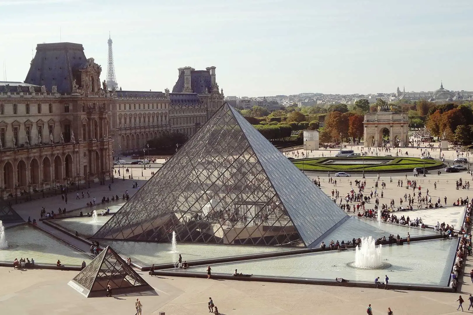
    Louvre
    Louvre
    Louvre
    Louvre
    Louvre
    Louvre
    • HTML
            
                
          <div class="grid grid-cols-3 gap-4">
            <div class="mb-4">
              <div class="relative max-w-xs overflow-hidden bg-cover bg-no-repeat">
                <img
                  src="https://tecdn.b-cdn.net/img/new/fluid/city/113.webp"
                  class="max-w-xs"
                  alt="Louvre" />
                <div
                  class="absolute top-0 right-0 bottom-0 left-0 h-full w-full overflow-hidden bg-indigo-700 bg-fixed opacity-0 transition duration-300 ease-in-out hover:opacity-50"></div>
              </div>
            </div>
            <div class="mb-4">
              <div class="relative max-w-xs overflow-hidden bg-cover bg-no-repeat">
                <img
                  src="https://tecdn.b-cdn.net/img/new/fluid/city/113.webp"
                  class="max-w-xs"
                  alt="Louvre" />
                <div
                  class="absolute top-0 right-0 bottom-0 left-0 h-full w-full overflow-hidden bg-purple-700 bg-fixed opacity-0 transition duration-300 ease-in-out hover:opacity-20"></div>
              </div>
            </div>
            <div class="mb-4">
              <div class="relative max-w-xs overflow-hidden bg-cover bg-no-repeat">
                <img
                  src="https://tecdn.b-cdn.net/img/new/fluid/city/113.webp"
                  class="max-w-xs"
                  alt="Louvre" />
                <div
                  class="absolute top-0 right-0 bottom-0 left-0 h-full w-full overflow-hidden bg-green-700 bg-fixed opacity-0 transition duration-300 ease-in-out hover:opacity-70"></div>
              </div>
            </div>
          </div>
          <div class="grid grid-cols-3 gap-4">
            <div class="mb-4 md:mb-0">
              <div class="relative max-w-xs overflow-hidden bg-cover bg-no-repeat">
                <img
                  src="https://tecdn.b-cdn.net/img/new/fluid/city/113.webp"
                  class="max-w-xs"
                  alt="Louvre" />
                <div
                  class="absolute top-0 right-0 bottom-0 left-0 h-full w-full overflow-hidden bg-red-700 bg-fixed opacity-0 transition duration-300 ease-in-out hover:opacity-30"></div>
              </div>
            </div>
            <div class="mb-4 md:mb-0">
              <div class="relative max-w-xs overflow-hidden bg-cover bg-no-repeat">
                <img
                  src="https://tecdn.b-cdn.net/img/new/fluid/city/113.webp"
                  class="max-w-xs"
                  alt="Louvre" />
                <div
                  class="absolute top-0 right-0 bottom-0 left-0 h-full w-full overflow-hidden bg-white bg-fixed opacity-0 transition duration-300 ease-in-out hover:opacity-40"></div>
              </div>
            </div>
            <div class="mb-4 md:mb-0">
              <div class="relative max-w-xs overflow-hidden bg-cover bg-no-repeat">
                <img
                  src="https://tecdn.b-cdn.net/img/new/fluid/city/113.webp"
                  class="max-w-xs"
                  alt="Louvre" />
                <div
                  class="absolute top-0 right-0 bottom-0 left-0 h-full w-full overflow-hidden bg-blue-400 bg-fixed opacity-0 transition duration-300 ease-in-out hover:opacity-60"></div>
              </div>
            </div>
          </div>


    Gradient

    Set a fancy gradient as an overlay.

    Louvre
    • HTML
            
                
          <div class="relative max-w-xs overflow-hidden bg-cover bg-no-repeat">
            <img
              src="https://tecdn.b-cdn.net/img/new/fluid/city/113.webp"
              class="max-w-xs"
              alt="Louvre" />
            <div
              class="absolute top-0 right-0 bottom-0 left-0 h-full w-full overflow-hidden bg-gradient-to-r from-indigo-500 via-purple-500 to-pink-500 opacity-0 transition duration-300 ease-in-out hover:opacity-70"></div>
          </div>


    Zoom

    Use .hover:scale-110 class to any element to apply zoom.

    Louvre
    • HTML
            
                
          <div class="relative max-w-xs overflow-hidden bg-cover bg-no-repeat">
            <img
              src="https://tecdn.b-cdn.net/img/new/fluid/city/113.webp"
              class="max-w-xs transition duration-300 ease-in-out hover:scale-110"
              alt="Louvre" />
          </div>


    Shadow

    Use .hover:shadow-lg class to any element to apply the effect.

    Louvre
    • HTML
            
                
          <img
            src="https://tecdn.b-cdn.net/img/new/fluid/city/113.webp"
            class="max-w-xs transition duration-300 ease-in-out hover:shadow-lg dark:hover:shadow-black/30"
            alt="Louvre" />


    Related resources

    Dropdown on hover Expanding Search Bar How to make Bootstrap image responsive How to center image Images Gallery

    If you are looking for more advanced options, try Bootstrap Hover effects from MDBootstrap.

    • Basic example
    • Color
    • Gradient
    • Zoom
    • Shadow
    • Related resources
    Get useful tips & free resources directly to your inbox along with exclusive subscriber-only content.
    Join our mailing list now
    © 2023 Copyright: MDBootstrap.com