Advanced grid
We have already learned the power of Grid CSS and we have successfully used it several times.
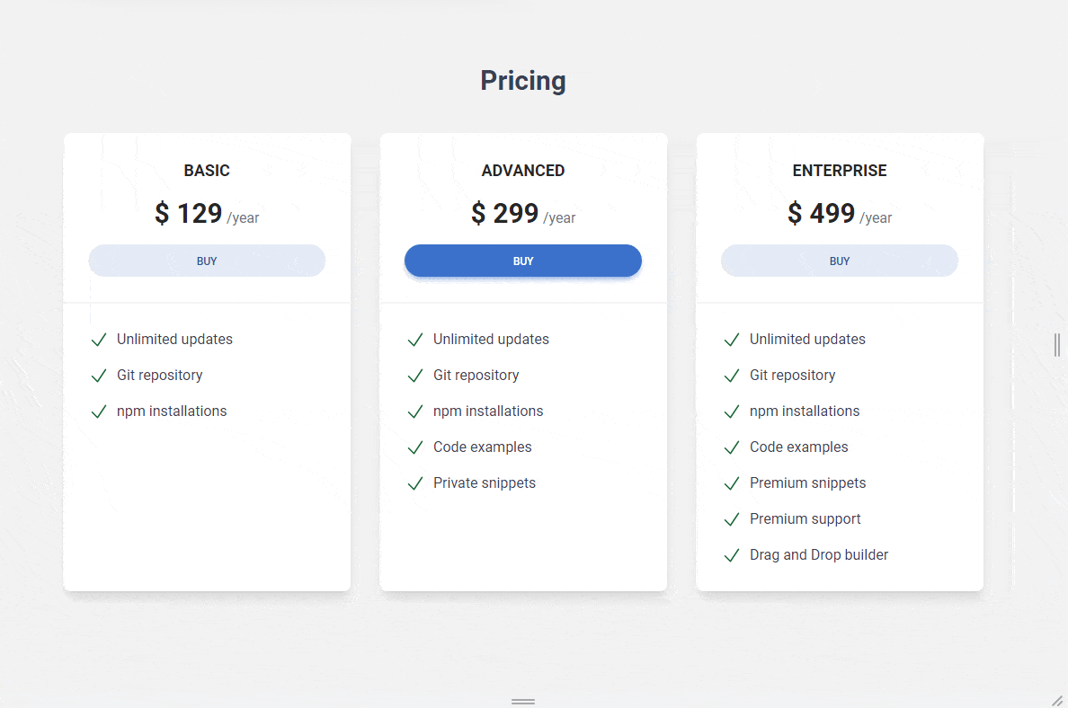
However, there is something about our Pricing section that I don't like. Let me explain what I mean.
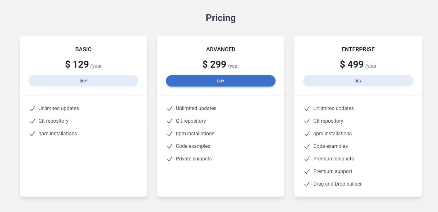
Our pricing cards look fine on large screens - they sit next to each other in three equal columns and that's fine.
It also looks fine on mobile - the cards stack one under another and that's desired behavior.
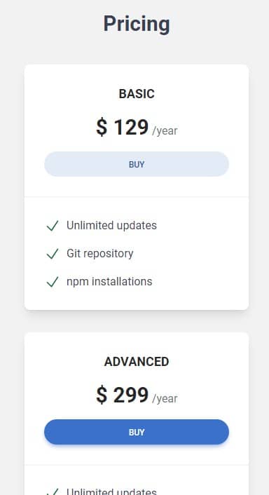
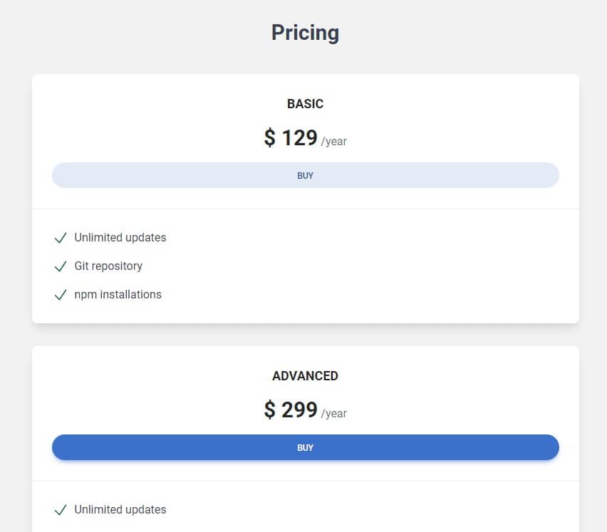
But there is a problem with medium screen size (tablet size) - in this case, cards also stack one under another, which doesn't look good. For me, it seems like we wasting a lot of space.
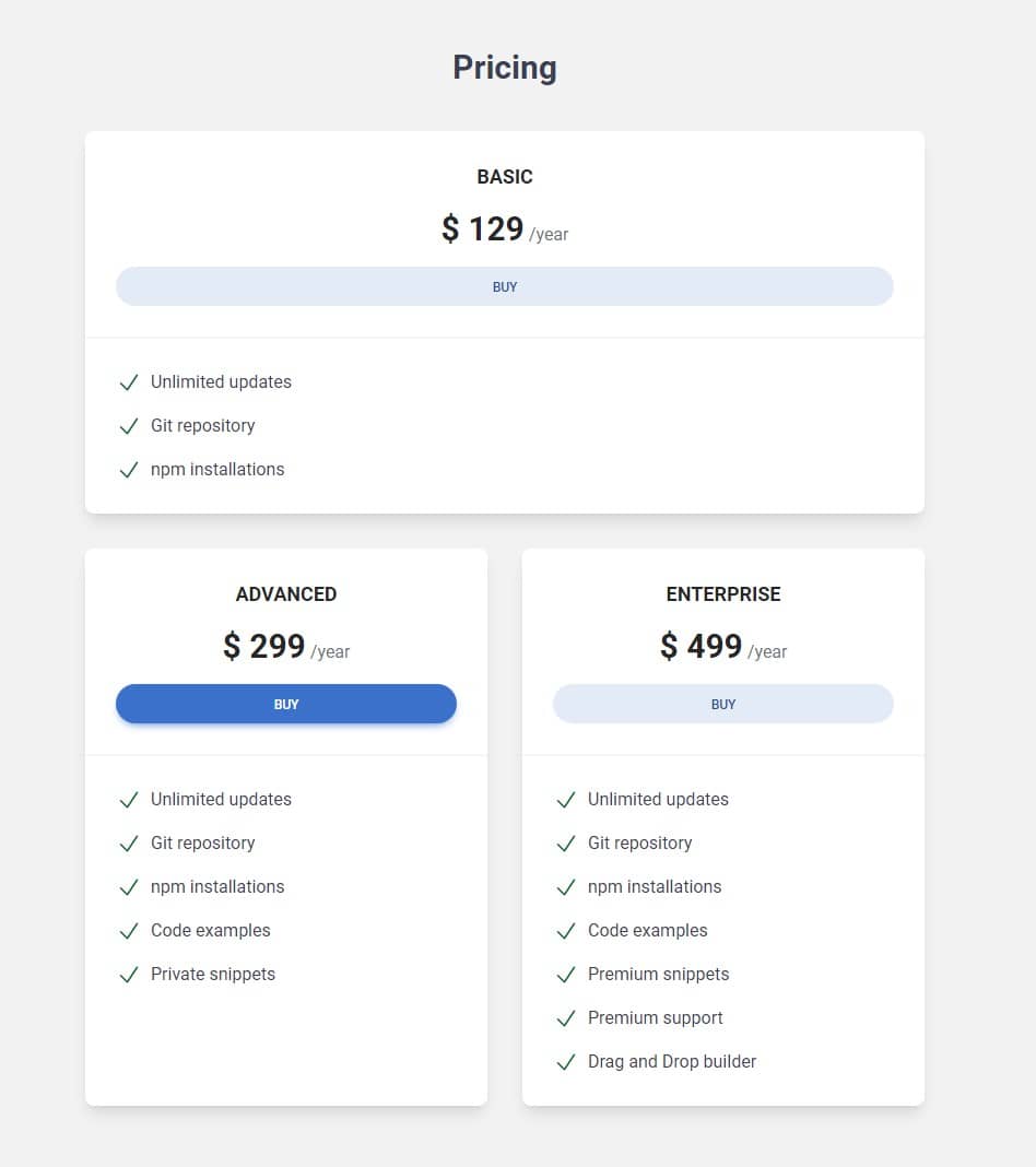
What I think would be better would be a change on medium screens so that the first tab is stretched to full width and the other two split the space in half.
Let's do this.
col-span classes
The col-span classes in Tailwind CSS provide a way to specify
how many columns a grid item should span across in a CSS Grid layout.
For example, let's take a grid with 3 columns, such as we have in our project:
    <div class="grid lg:grid-cols-3">
      <div class="bg-blue-300"><h5>Column 1.</h5></div>
      <div class="bg-red-300"><h5>Column 2.</h5></div>
      <div class="bg-green-300"><h5>Column 3.</h5></div>
    </div>
This is what our 3 columns will look like - by default, each takes the same
width - that is, one unit out of the 3 available (because we set 3 columns
using the .grid-cols-3 class).
Column 1.
Column 2.
Column 3.
However, if we want the first column to be wider than the others, we can add
a .col-span-2 class to it, so it will occupy 2 of the 3
available column units.
    <div class="grid lg:grid-cols-3">
      <div class="col-span-2 bg-blue-300"><h5>Column 1.</h5></div>
      <div class="bg-red-300"><h5>Column 2.</h5></div>
      <div class="bg-green-300"><h5>Column 3.</h5></div>
    </div>
Of course, this pushed the third (green) column to the row below, because the first two columns used the 3 unit limit (the blue column took 2 units and the red one took 1).
There was no more space for the green column 😢 But don't worry, we'll get to that later.
Column 1.
Column 2.
Column 3.
We can even set each column to occupy a different number of columns. In the
example below, we'll use .col-span-3 for the red column and
.col-span-2 for the green column.
    <div class="grid lg:grid-cols-3">
      <div class="bg-blue-300"><h5>Column 1.</h5></div>
      <div class="col-span-3 bg-red-300"><h5>Column 2.</h5></div>
      <div class="col-span-2 bg-green-300"><h5>Column 3.</h5></div>
    </div>
Column 1.
Column 2.
Column 3.
I think you get the concept 😉
Importantly, we can use these .col-span classes with
breakpoints, which will allow us to set different column
widths on different screens.
This is exactly what we need to set our pricing cards in the layout we want on the tablet view.
Step 1 - update grid in pricing section
The first thing we need to do is update our grid to only have 2 columns on medium screens.
Thanks to this, we will be able to divide the space equally between the second and third columns on medium screens, and the first one will take full width.
So let's add md:grid-cols-2 class before
lg:grid-cols-3
    <!-- Section: Pricing -->
    <section class="mb-28 text-center">
      <h3 class="mb-10 text-3xl font-semibold text-gray-700 dark:text-white">
        Pricing
      </h3>

      <div class="grid gap-8 md:grid-cols-2 lg:grid-cols-3">[...]</div>
    </section>
    <!-- Section: Pricing -->
Step 2 - update columns
Next, let's add .col-span classes and breakpoints to the cards.
We need to add md:col-span-2 lg:col-span-1 classes to the
first card and md:col-span-1 lg:col-span-1 to
the second and third cards.
    <div class="grid gap-8 md:grid-cols-2 lg:grid-cols-3">
      <!-- Card basic -->
      <div
        class="block rounded-lg bg-white text-center shadow-lg dark:bg-neutral-700 md:col-span-2 lg:col-span-1">
        [...]
      </div>
      <!-- Card basic-->

      <!-- Card advanced -->
      <div
        class="block rounded-lg bg-white text-center shadow-lg dark:bg-neutral-700 md:col-span-1 lg:col-span-1">
        [...]
      </div>
      <!-- Card advanced-->

      <!-- Card enterprise -->
      <div
        class="block rounded-lg bg-white text-center shadow-lg dark:bg-neutral-700 md:col-span-1 lg:col-span-1">
        [...]
      </div>
      <!-- Card enterprise-->
    </div>
Et voilà!
Note: If you want to practice on your own and have a look at more examples you can play with our grid generator.

About author
Michal Szymanski
Co Founder at TW Elements and MDBootstrap / Listed in Forbes „30 under 30" / Open-source enthusiast / Dancer, nerd & book lover.
Author of hundreds of articles on programming, business, marketing and productivity. In the past, an educator working with troubled youth in orphanages and correctional facilities.