Material Minimal
Let's stop for a moment and look at one very important concept - TW Elements design system called Material Minimal.
Designing a user interface (UI) is a complex process that requires a cohesive, scalable, and sustainable approach. To meet these demands, some kind of system is needed to prevent us from constantly reinventing the wheel.
However limiting it may seem (and arousing resistance especially for those designers who feel more like artists than craftsmen), I would like you to remember one thing:
We need something to limit our design choices. Something that will stop us from thinking with every single button about how much rounded corners or how strong shadows we should use.
To be precise - we need a Design System.
What exactly is Design System?
Design System is a comprehensive set of standards that guides the creation of a product’s UI.
It includes a library of design elements such as colors, typography, components, and patterns, along with guidelines on how to use them. It also often encapsulates the principles and values that drive a product's design decisions.


The aim of a design system is to facilitate consistency, efficiency, and scalability in the design process.
About Material Minimal
On the one hand, Material Minimal appreciates and uses the standard created by Google, and on the other hand improves it, giving it lightness, subtlety and elegance.

Material Minimal seeks a golden mean between the naturalness of the real world and the functionality necessary in the digital world.
Elements such as shadows or gradients allow it to get closer to nature (as our real world is full of shadows and gradients), while minimalism is a nod to the user experience and aims to prepare space for the most important actor - content.
Classic Material Design
Before we dive deeper into Material Minimal, let's take a look at the classic Material Design created by Google.
According to the official Material Design website:
"Material is the metaphor"
"Material Design is inspired by the physical world and its textures, including how they reflect light and cast shadows. Material surfaces reimagine the mediums of paper and ink."
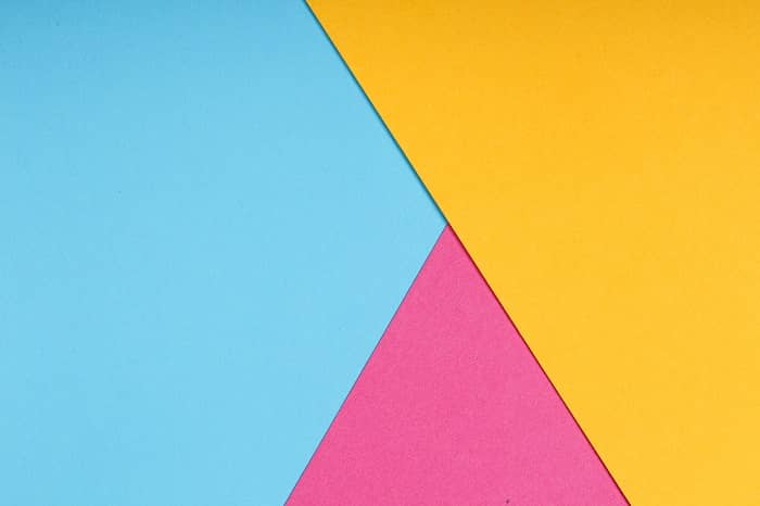
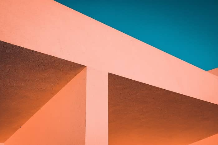
Real-life objects
Digital Material Design objects
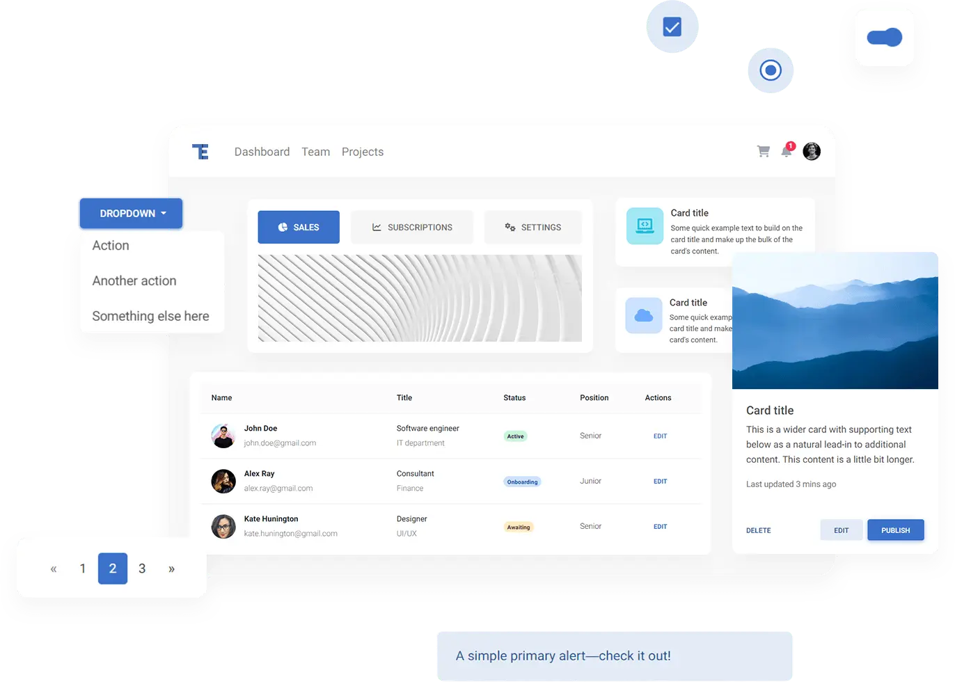
Classic Material Design component
For many years we have tried to follow the Material Design guidelines as closely as possible. However, as time went on, we began to see more and more aspects that could be improved.
Classic Material Design can be heavy, clunky and monotonous. Fortunately, with the release of Material Design 3, Google changed its approach to its guidelines.
"The latest version of Material Design (v.3) includes personalization and accessibility features that put people at the center"
In other words - use the best in Material Design, but at the same time personalize and adapt it to your needs.
We take full advantage of this principle by creating our own, improved version of Material Design, i.e. Material Minimal.
Material Minimal core values
The foundations of the Material Minimal design system are three core values.
Material Minimal is:
Natural
Material Minimal is inspired by the physical world and its textures, including how they reflect light and cast shadows. Material surfaces reimagine the mediums of paper and ink. This value is proudly inherited from Material Design.
Clear
It's a style that needs to breathe. It loves space and lightness. Minimalist and clean in form, it is supposed to prevent the user from feeling overwhelmed and confused. Material Minimal wants to be the stage where the content is the main actor.
Scalable
It grows with your project. A clear hierarchy and strict rules from the very beginning lay a solid foundation so that the UI is able to provide an excellent user experience, even when its complexity increases significantly.
These values are reflected in some of the most important principles:
- Accessibility and usefulness as fundamental principles
- Clear hierarchy of elements and colors
- Clear contrast
- Subtle shadows (often smudged with color)
- Gently rounded corners in the components
- Focus on details
- Bright backgrounds (however, full dark mode is welcome)
- Extensive whitespace
- Big, readable headings
- Clear and accessible typography
- Real-life photography
- Limited use of effects
In general, UI designed with Material Minimal should be light, clean, fresh, and aesthetically pleasing.
Want to improve your web design skills?
If you want to learn more about Material Minimal and learn how to design beautiful digital interfaces - check out our official tutorial on this topic:
Learn advanced web design
About author
Michal Szymanski
Co Founder at TW Elements and MDBootstrap / Listed in Forbes „30 under 30" / Open-source enthusiast / Dancer, nerd & book lover.
Author of hundreds of articles on programming, business, marketing and productivity. In the past, an educator working with troubled youth in orphanages and correctional facilities.