Carousel
Carousel is a very representative component. It is perfect for presenting various types of media - from photos to videos.
As we know from previous lessons, Tailwind CSS itself does not provide such components, but the TW Elements library does.
Let's learn how to use it in our project.
Step 1 - add empty section with grid
First, we need to prepare a space where we will place the carousel.
Under the <header> section we have the
<main> section. We'll put a container with
mx-auto class to center it.
    <!--Main layout-->
    <main>
      <div class="container mx-auto"></div>
    </main>
    <!--Main layout-->
Inside the container, let's add a new empty section, and in it we will place a grid with 2 columns.
We will call this section "Details" because it will contain details about our project.
    <!--Main layout-->
    <main>
      <div class="container mx-auto">
        <!-- Section: Details -->
        <section class="">
          <div class="grid gap-8 lg:grid-cols-2"></div>
        </section>
        <!-- Section: Details -->
      </div>
    </main>
    <!--Main layout-->
A short reminder from previous lessons:
-
grid: This is a shorthand fordisplay: grid. It sets up a new grid container. -
lg:grid-cols-2: This is a responsive grid class that sets up a grid with 2 columns when the viewport islg(large) or larger. Thelg:prefix in Tailwind CSS stands for "large screens", and by default it applies to screens wider than 1024px.This means that for large screens and above, the grid will have 2 columns. For smaller screens (below 1024px), the grid will default to 1 column (if not overridden by other classes) because grid items, by default, stretch to take up the full width of the grid container.
-
gap-8: This class adds a gutter or gap between your grid items. The8ingap-8is a spacing scale in Tailwind CSS which, by default, represents2rem(32 pixels). This means that there will be a 32-pixel gap between the grid's rows and columns.
Step 2 - add a carousel
Go to the carousel documentation page and copy the basic example code. Then paste it into the grid in the Details section.
    <!-- Section: Details -->
    <section class="">
      <div class="grid gap-8 lg:grid-cols-2">
        <!-- Carousel -->
        <div
          id="carouselExampleCaptions"
          class="relative"
          data-twe-carousel-init
          data-twe-carousel-slide>
          <!--Carousel indicators-->
          <div
            class="absolute bottom-0 left-0 right-0 z-[2] mx-[15%] mb-4 flex list-none justify-center p-0"
            data-twe-carousel-indicators>
            <button
              type="button"
              data-twe-target="#carouselExampleCaptions"
              data-twe-slide-to="0"
              data-twe-carousel-active
              class="mx-[3px] box-content h-[3px] w-[30px] flex-initial cursor-pointer border-0 border-y-[10px] border-solid border-transparent bg-white bg-clip-padding p-0 -indent-[999px] opacity-50 transition-opacity duration-[600ms] ease-[cubic-bezier(0.25,0.1,0.25,1.0)] motion-reduce:transition-none"
              aria-current="true"
              aria-label="Slide 1"></button>
            <button
              type="button"
              data-twe-target="#carouselExampleCaptions"
              data-twe-slide-to="1"
              class="mx-[3px] box-content h-[3px] w-[30px] flex-initial cursor-pointer border-0 border-y-[10px] border-solid border-transparent bg-white bg-clip-padding p-0 -indent-[999px] opacity-50 transition-opacity duration-[600ms] ease-[cubic-bezier(0.25,0.1,0.25,1.0)] motion-reduce:transition-none"
              aria-label="Slide 2"></button>
            <button
              type="button"
              data-twe-target="#carouselExampleCaptions"
              data-twe-slide-to="2"
              class="mx-[3px] box-content h-[3px] w-[30px] flex-initial cursor-pointer border-0 border-y-[10px] border-solid border-transparent bg-white bg-clip-padding p-0 -indent-[999px] opacity-50 transition-opacity duration-[600ms] ease-[cubic-bezier(0.25,0.1,0.25,1.0)] motion-reduce:transition-none"
              aria-label="Slide 3"></button>
          </div>

          <!--Carousel items-->
          <div
            class="relative w-full overflow-hidden after:clear-both after:block after:content-['']">
            <!--First item-->
            <div
              class="relative float-left -me-[100%] w-full transition-transform duration-[600ms] ease-in-out motion-reduce:transition-none"
              data-twe-carousel-active
              data-twe-carousel-item
              style="backface-visibility: hidden">
              <img
                src="https://tecdn.b-cdn.net/img/Photos/Slides/img%20(15).jpg"
                class="block w-full"
                alt="..." />
              <div
                class="absolute inset-x-[15%] bottom-5 hidden py-5 text-center text-white md:block">
                <h5 class="text-xl">First slide label</h5>
                <p>
                  Some representative placeholder content for the first slide.
                </p>
              </div>
            </div>
            <!--Second item-->
            <div
              class="relative float-left -me-[100%] hidden w-full transition-transform duration-[600ms] ease-in-out motion-reduce:transition-none"
              data-twe-carousel-item
              style="backface-visibility: hidden">
              <img
                src="https://tecdn.b-cdn.net/img/Photos/Slides/img%20(22).jpg"
                class="block w-full"
                alt="..." />
              <div
                class="absolute inset-x-[15%] bottom-5 hidden py-5 text-center text-white md:block">
                <h5 class="text-xl">Second slide label</h5>
                <p>
                  Some representative placeholder content for the second slide.
                </p>
              </div>
            </div>
            <!--Third item-->
            <div
              class="relative float-left -me-[100%] hidden w-full transition-transform duration-[600ms] ease-in-out motion-reduce:transition-none"
              data-twe-carousel-item
              style="backface-visibility: hidden">
              <img
                src="https://tecdn.b-cdn.net/img/Photos/Slides/img%20(23).jpg"
                class="block w-full"
                alt="..." />
              <div
                class="absolute inset-x-[15%] bottom-5 hidden py-5 text-center text-white md:block">
                <h5 class="text-xl">Third slide label</h5>
                <p>
                  Some representative placeholder content for the third slide.
                </p>
              </div>
            </div>
          </div>

          <!--Carousel controls - prev item-->
          <button
            class="absolute bottom-0 left-0 top-0 z-[1] flex w-[15%] items-center justify-center border-0 bg-none p-0 text-center text-white opacity-50 transition-opacity duration-150 ease-[cubic-bezier(0.25,0.1,0.25,1.0)] hover:text-white hover:no-underline hover:opacity-90 hover:outline-none focus:text-white focus:no-underline focus:opacity-90 focus:outline-none motion-reduce:transition-none"
            type="button"
            data-twe-target="#carouselExampleCaptions"
            data-twe-slide="prev">
            <span class="inline-block h-8 w-8">
              <svg
                xmlns="http://www.w3.org/2000/svg"
                fill="none"
                viewBox="0 0 24 24"
                stroke-width="1.5"
                stroke="currentColor"
                class="h-6 w-6">
                <path
                  stroke-linecap="round"
                  stroke-linejoin="round"
                  d="M15.75 19.5L8.25 12l7.5-7.5" />
              </svg>
            </span>
            <span
              class="!absolute !-m-px !h-px !w-px !overflow-hidden !whitespace-nowrap !border-0 !p-0 ![clip:rect(0,0,0,0)]"
              >Previous</span
            >
          </button>
          <!--Carousel controls - next item-->
          <button
            class="absolute bottom-0 right-0 top-0 z-[1] flex w-[15%] items-center justify-center border-0 bg-none p-0 text-center text-white opacity-50 transition-opacity duration-150 ease-[cubic-bezier(0.25,0.1,0.25,1.0)] hover:text-white hover:no-underline hover:opacity-90 hover:outline-none focus:text-white focus:no-underline focus:opacity-90 focus:outline-none motion-reduce:transition-none"
            type="button"
            data-twe-target="#carouselExampleCaptions"
            data-twe-slide="next">
            <span class="inline-block h-8 w-8">
              <svg
                xmlns="http://www.w3.org/2000/svg"
                fill="none"
                viewBox="0 0 24 24"
                stroke-width="1.5"
                stroke="currentColor"
                class="h-6 w-6">
                <path
                  stroke-linecap="round"
                  stroke-linejoin="round"
                  d="M8.25 4.5l7.5 7.5-7.5 7.5" />
              </svg>
            </span>
            <span
              class="!absolute !-m-px !h-px !w-px !overflow-hidden !whitespace-nowrap !border-0 !p-0 ![clip:rect(0,0,0,0)]"
              >Next</span
            >
          </button>
        </div>
        <!-- Carousel -->
      </div>
    </section>
    <!-- Section: Details -->
Also, don't forget to initialize the carousel in the
src/js/index.js file:
      // Initialization for ES Users
      import {
          Collapse,
          Dropdown,
          Ripple,
          Carousel,
          initTWE
      } from 'tw-elements';

      initTWE({ Collapse, Dropdown, Ripple, Carousel });
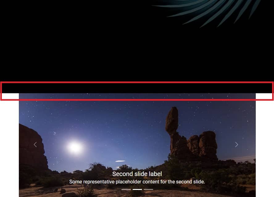
After saving the file and refreshing your browser, you should see the carousel. You can change the slide by clicking on the arrows on the sides.
.jpg)
.jpg)
.jpg)
Before we get to explaining how the carousel works, we need to fix one little problem.
As you can see the carousel is "touching" our Hero Image and it doesn't look good. A space would be useful there, so we will use the already well-known spacing.
Step 3 - add bottom margin to the <header>
We already know how to add spacing to any element but there is one more important thing that I wanted to mention by the way.
Note that to add space between the <header> section and
the carousel section, we can add both the bottom margin to
the <header> section and the
top margin to the carousel section and the
visual effect will be the same.
However, if you add a top margin to a section and a bottom margin when creating a core layout, it will create inconsistencies and make it difficult to maintain the design later.
Therefore, it is good practice to choose one method of adding spacing when creating a layout and stick to it.
I recommend you always use the bottom margin when positioning large elements relative to each other and I will do so in these tutorials.
So let's add the class .mb-14 to the
<header> section to add a bottom margin to it.
    <!--Main Navigation-->
    <header class="mb-14">[...]</header>
    <!--Main Navigation-->
And by the way, add the .mb-28 class to the
"Details" section, where we have placed our carousel.
    <!-- Section: Details -->
    <section class="mb-28">[...]</section>
    <!-- Section: Details -->
How the carousel works
    <!-- Carousel -->
    <div
      id="carouselExampleCaptions"
      class="relative"
      data-twe-carousel-init
      data-twe-carousel-slide>
      [...]
    </div>
    <!-- Carousel -->
-
The carousel requires an individual ID (in this case,
id="carouselExampleCaptions"). If you have more than one carousel in your project and they don't have different IDs, they will collide with each other and won't work properly. -
It has a
relativepositioning so the absolute-positioned elements within it (like controls and indicators) will be positioned relative to this container. -
data-twe-carousel-initanddata-twe-carousel-slideattributes are required so Tailwind Elements library can apply JavaScript to the carousel and simply make it works.
Indicators
As the first child item in the carousel component you can see indicators
    <!--Carousel indicators-->
    <div
      class="absolute bottom-0 left-0 right-0 z-[2] mx-[15%] mb-4 flex list-none justify-center p-0"
      data-twe-carousel-indicators>
      <button
        type="button"
        data-twe-target="#carouselExampleCaptions"
        data-twe-slide-to="0"
        data-twe-carousel-active
        class="mx-[3px] box-content h-[3px] w-[30px] flex-initial cursor-pointer border-0 border-y-[10px] border-solid border-transparent bg-white bg-clip-padding p-0 -indent-[999px] opacity-50 transition-opacity duration-[600ms] ease-[cubic-bezier(0.25,0.1,0.25,1.0)] motion-reduce:transition-none"
        aria-current="true"
        aria-label="Slide 1"></button>
      <button
        type="button"
        data-twe-target="#carouselExampleCaptions"
        data-twe-slide-to="1"
        class="mx-[3px] box-content h-[3px] w-[30px] flex-initial cursor-pointer border-0 border-y-[10px] border-solid border-transparent bg-white bg-clip-padding p-0 -indent-[999px] opacity-50 transition-opacity duration-[600ms] ease-[cubic-bezier(0.25,0.1,0.25,1.0)] motion-reduce:transition-none"
        aria-label="Slide 2"></button>
      <button
        type="button"
        data-twe-target="#carouselExampleCaptions"
        data-twe-slide-to="2"
        class="mx-[3px] box-content h-[3px] w-[30px] flex-initial cursor-pointer border-0 border-y-[10px] border-solid border-transparent bg-white bg-clip-padding p-0 -indent-[999px] opacity-50 transition-opacity duration-[600ms] ease-[cubic-bezier(0.25,0.1,0.25,1.0)] motion-reduce:transition-none"
        aria-label="Slide 3"></button>
    </div>
These are the little dashes that indicate the active slide. They are interactive and you can click on them to jump directly to the corresponding slide.

How indicators work:
-
data-twe-target="#carouselExampleCaptions"attribute indicates which carousel the indicators are linked to. In this case, via the#carouselExampleCaptionsmentioned earlier, they point to our carousel. -
data-twe-slide-toattributes indicate which slide the indicator should be linked to. They are zero-indexed, so first slide = 0, second slide = 1, and so on. -
data-twe-carousel-activeattribute indicates which slide should be active at start. If you want the second slide to start the carousel, you have to move this class to the selected slide.
Carousel items
These are our actual slides.
    <!--Carousel items-->
    <div
      class="relative w-full overflow-hidden after:clear-both after:block after:content-['']">
      <!--First item-->
      <div
        class="relative float-left -me-[100%] w-full transition-transform duration-[600ms] ease-in-out motion-reduce:transition-none"
        data-twe-carousel-active
        data-twe-carousel-item
        style="backface-visibility: hidden">
        <img
          src="https://tecdn.b-cdn.net/img/Photos/Slides/img%20(15).jpg"
          class="block w-full"
          alt="..." />
        <div
          class="absolute inset-x-[15%] bottom-5 hidden py-5 text-center text-white md:block">
          <h5 class="text-xl">First slide label</h5>
          <p>Some representative placeholder content for the first slide.</p>
        </div>
      </div>
      <!--Second item-->
      <div
        class="relative float-left -me-[100%] hidden w-full transition-transform duration-[600ms] ease-in-out motion-reduce:transition-none"
        data-twe-carousel-item
        style="backface-visibility: hidden">
        <img
          src="https://tecdn.b-cdn.net/img/Photos/Slides/img%20(22).jpg"
          class="block w-full"
          alt="..." />
        <div
          class="absolute inset-x-[15%] bottom-5 hidden py-5 text-center text-white md:block">
          <h5 class="text-xl">Second slide label</h5>
          <p>Some representative placeholder content for the second slide.</p>
        </div>
      </div>
      <!--Third item-->
      <div
        class="relative float-left -me-[100%] hidden w-full transition-transform duration-[600ms] ease-in-out motion-reduce:transition-none"
        data-twe-carousel-item
        style="backface-visibility: hidden">
        <img
          src="https://tecdn.b-cdn.net/img/Photos/Slides/img%20(23).jpg"
          class="block w-full"
          alt="..." />
        <div
          class="absolute inset-x-[15%] bottom-5 hidden py-5 text-center text-white md:block">
          <h5 class="text-xl">Third slide label</h5>
          <p>Some representative placeholder content for the third slide.</p>
        </div>
      </div>
    </div>
Inside the Carousel items we see Items. Each Item is a single slide.
    <!--First item-->
    <div
      class="relative float-left -me-[100%] w-full transition-transform duration-[600ms] ease-in-out motion-reduce:transition-none"
      data-twe-carousel-active
      data-twe-carousel-item
      style="backface-visibility: hidden">
      <img
        src="https://tecdn.b-cdn.net/img/Photos/Slides/img%20(15).jpg"
        class="block w-full"
        alt="..." />
      <div
        class="absolute inset-x-[15%] bottom-5 hidden py-5 text-center text-white md:block">
        <h5 class="text-xl">First slide label</h5>
        <p>Some representative placeholder content for the first slide.</p>
      </div>
    </div>
As with indicators, the active slide contains the
data-twe-carousel-active attribute. You can change it if you
want the carousel to start with another active slide by default.
Next you can see the most important actor in this theater - the
<img> element containing the image. In addition, it
contains the block class (display: block) to
ensure that the image displays correctly, and the w-full (width: 100%) class to ensure that the image will stretch to 100% of the width of the
carousel.
Below the image you can see Captions element. With it, you
can add a heading and description to your carousel slides. In addition, it
contains the hidden and md:block classes, which
make the caption disappear on small screens and only appear on medium and
larger screens. This is to prevent unwanted behavior, as on small screens
the caption may completely cover the image.
Controls
The last element in the carousel are controls, i.e. buttons - arrows visible on the sides of the slides. They are, of course, used to switch between one slide and the next.

    <!--Carousel controls - prev item-->
    <button
      class="absolute bottom-0 left-0 top-0 z-[1] flex w-[15%] items-center justify-center border-0 bg-none p-0 text-center text-white opacity-50 transition-opacity duration-150 ease-[cubic-bezier(0.25,0.1,0.25,1.0)] hover:text-white hover:no-underline hover:opacity-90 hover:outline-none focus:text-white focus:no-underline focus:opacity-90 focus:outline-none motion-reduce:transition-none"
      type="button"
      data-twe-target="#carouselExampleCaptions"
      data-twe-slide="prev">
      <span class="inline-block h-8 w-8">
        <svg
          xmlns="http://www.w3.org/2000/svg"
          fill="none"
          viewBox="0 0 24 24"
          stroke-width="1.5"
          stroke="currentColor"
          class="h-6 w-6">
          <path
            stroke-linecap="round"
            stroke-linejoin="round"
            d="M15.75 19.5L8.25 12l7.5-7.5" />
        </svg>
      </span>
      <span
        class="!absolute !-m-px !h-px !w-px !overflow-hidden !whitespace-nowrap !border-0 !p-0 ![clip:rect(0,0,0,0)]"
        >Previous</span
      >
    </button>
    <!--Carousel controls - next item-->
    <button
      class="absolute bottom-0 right-0 top-0 z-[1] flex w-[15%] items-center justify-center border-0 bg-none p-0 text-center text-white opacity-50 transition-opacity duration-150 ease-[cubic-bezier(0.25,0.1,0.25,1.0)] hover:text-white hover:no-underline hover:opacity-90 hover:outline-none focus:text-white focus:no-underline focus:opacity-90 focus:outline-none motion-reduce:transition-none"
      type="button"
      data-twe-target="#carouselExampleCaptions"
      data-twe-slide="next">
      <span class="inline-block h-8 w-8">
        <svg
          xmlns="http://www.w3.org/2000/svg"
          fill="none"
          viewBox="0 0 24 24"
          stroke-width="1.5"
          stroke="currentColor"
          class="h-6 w-6">
          <path
            stroke-linecap="round"
            stroke-linejoin="round"
            d="M8.25 4.5l7.5 7.5-7.5 7.5" />
        </svg>
      </span>
      <span
        class="!absolute !-m-px !h-px !w-px !overflow-hidden !whitespace-nowrap !border-0 !p-0 ![clip:rect(0,0,0,0)]"
        >Next</span
      >
    </button>
Just like indicators, they use the
data-twe-target="#carouselExampleCaptions" attribute to
indicate which carousel they should be connected to.
Other than that, the rest of the classes and attributes should not be modified, as they are required exactly as they are to ensure proper work of controls.
And that's all the most important information about the carousel. If you want, you can change the photos and caption in your project to what you like. You can also experiment with the carousel and see more options available on the carousel documentation page.
When you are ready, click the "next" button to go to the next lesson.

About author
Michal Szymanski
Co Founder at TW Elements and MDBootstrap / Listed in Forbes „30 under 30" / Open-source enthusiast / Dancer, nerd & book lover.
Author of hundreds of articles on programming, business, marketing and productivity. In the past, an educator working with troubled youth in orphanages and correctional facilities.